Clear at a glance
Use an SVG preview on the slide, so the architecture stays legible and the presentation remains lightweight.
A tiny Slidev addon with a bigger view
Keep a crisp, print-safe diagram on the slide. Open the full Archify viewer only when someone wants to dig deeper.
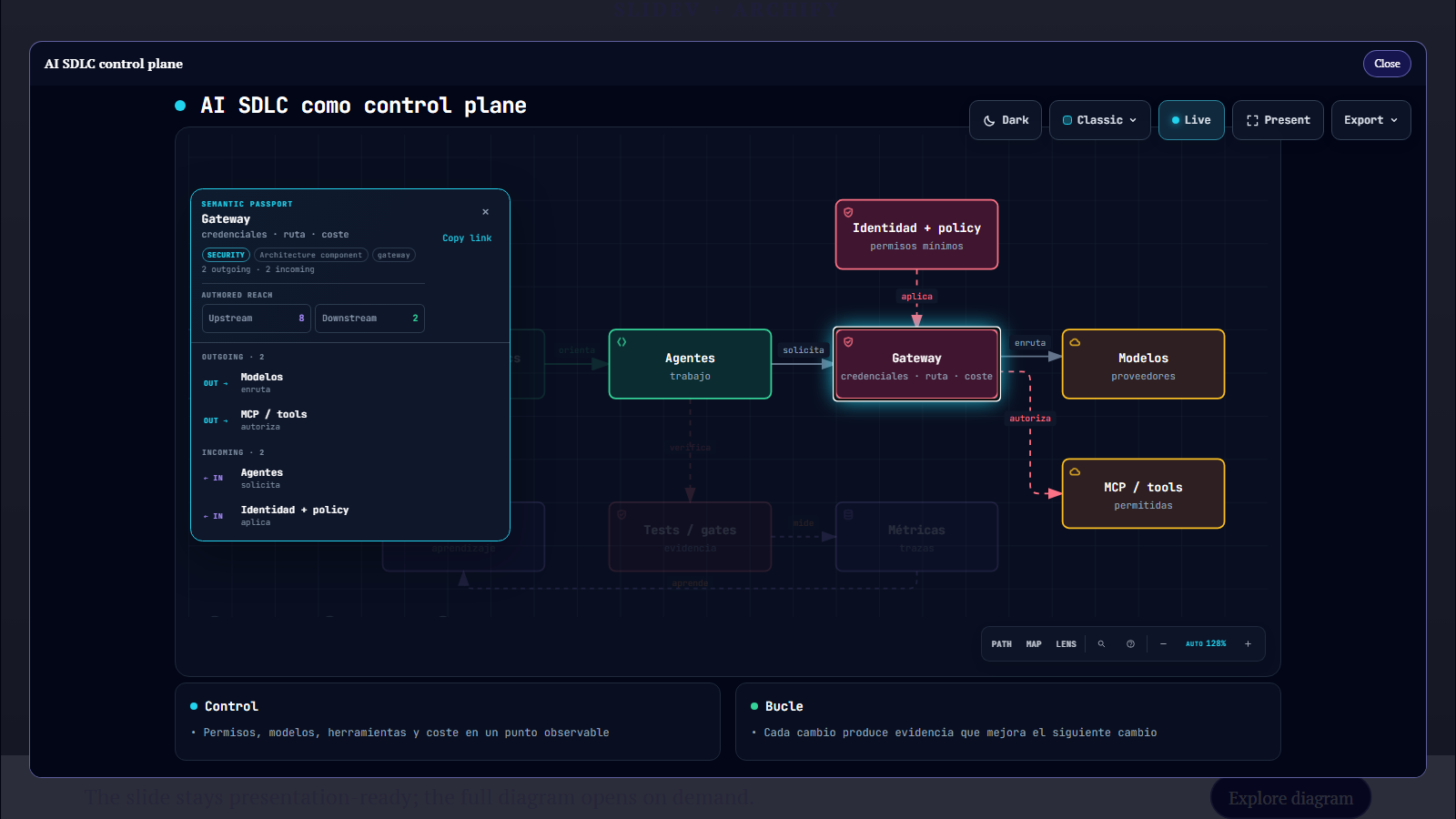
See it in context
Use the presentation controls or arrow keys to move through the example. Select the diagram to open its interactive Archify view.
←→ Navigate slides · Click the diagram to explore its nodes and relationships.
Small surface, useful details
Use an SVG preview on the slide, so the architecture stays legible and the presentation remains lightweight.
Open Archify’s standalone viewer in a native dialog to focus nodes, follow relationships, and use its controls.
Slidev print and PDF output keeps the static diagram and omits the interactive dialog.
Get started
Install the addon, declare it in your Slidev frontmatter, then point the component at files in your deck’s public folder.
npm install --save-dev slidev-addon-archify-exploreraddons:
- slidev-addon-archify-explorer<ArchifyExplorer
preview="diagrams/system.svg"
src="diagrams/system.html"
title="System architecture"
alt="System architecture diagram"
/>Component API
Pass local files from your deck’s public directory. The default slot lets you provide a custom preview or layout.
| Prop / slot | Type | Default | Purpose |
|---|---|---|---|
src | string · required | — | Path to the standalone Archify HTML viewer. |
title | string · required | — | Accessible name for the explorer dialog. |
preview | string | — | Optional SVG shown as the clickable slide preview. |
alt | string | title | Alternative text for the preview image. |
buttonLabel | string | Explore diagram | Accessible action label for the preview button. |
closeLabel | string | Close | Localized label for the dialog close button. |
default slot | Vue template | — | Custom preview content; retained in print mode. |
Open source · MIT
Try the demo, add the addon to a deck, or help improve the component.